
L2P.lol is a League of Legends community website created by Narkuss, a French Twitch streamer to help players find mates to play with and to participate in tournaments organized by L2P.lol.
The original design
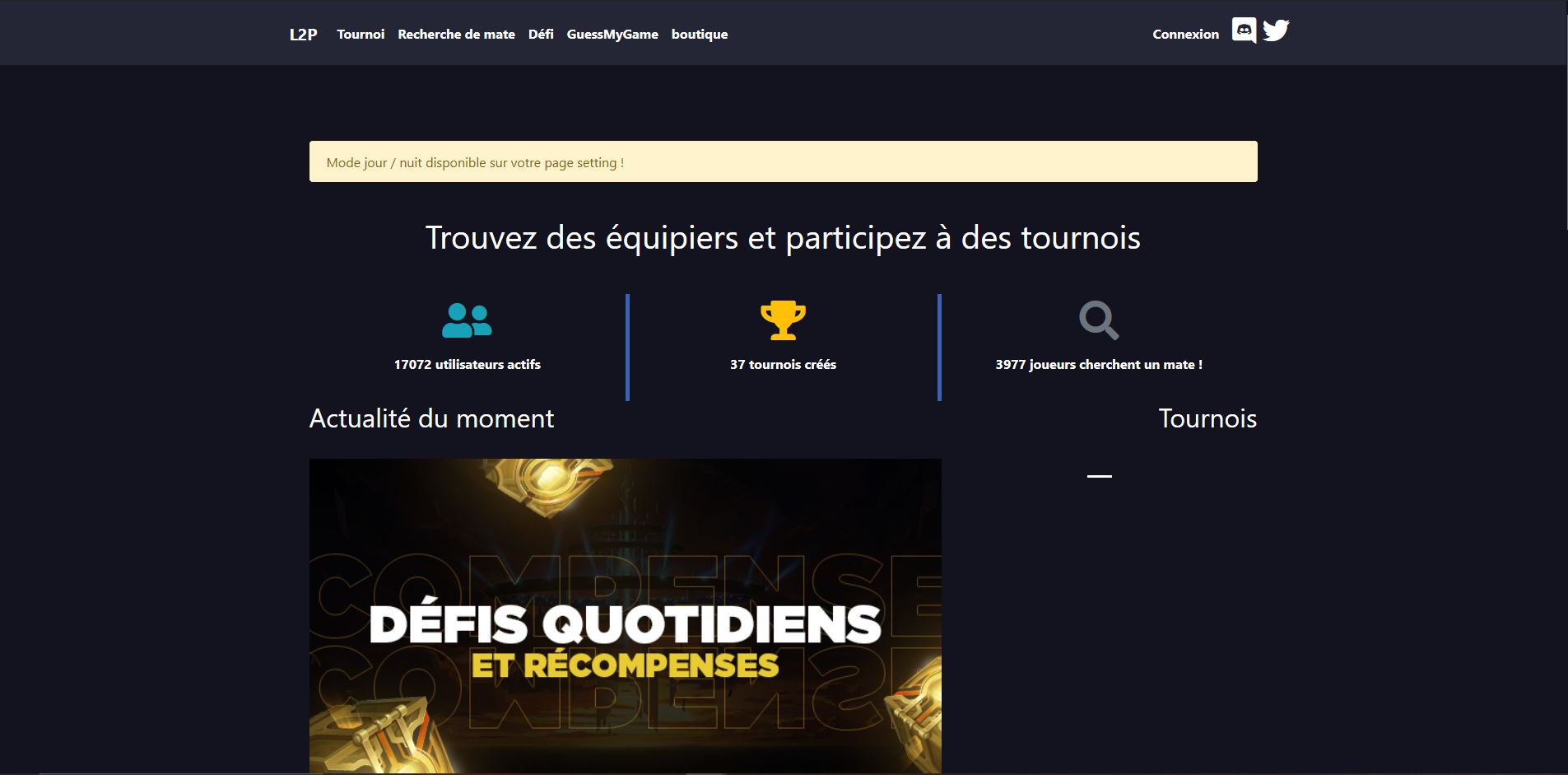
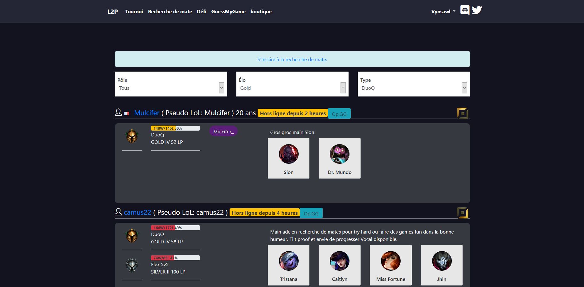
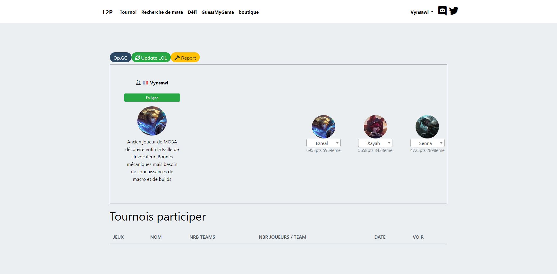
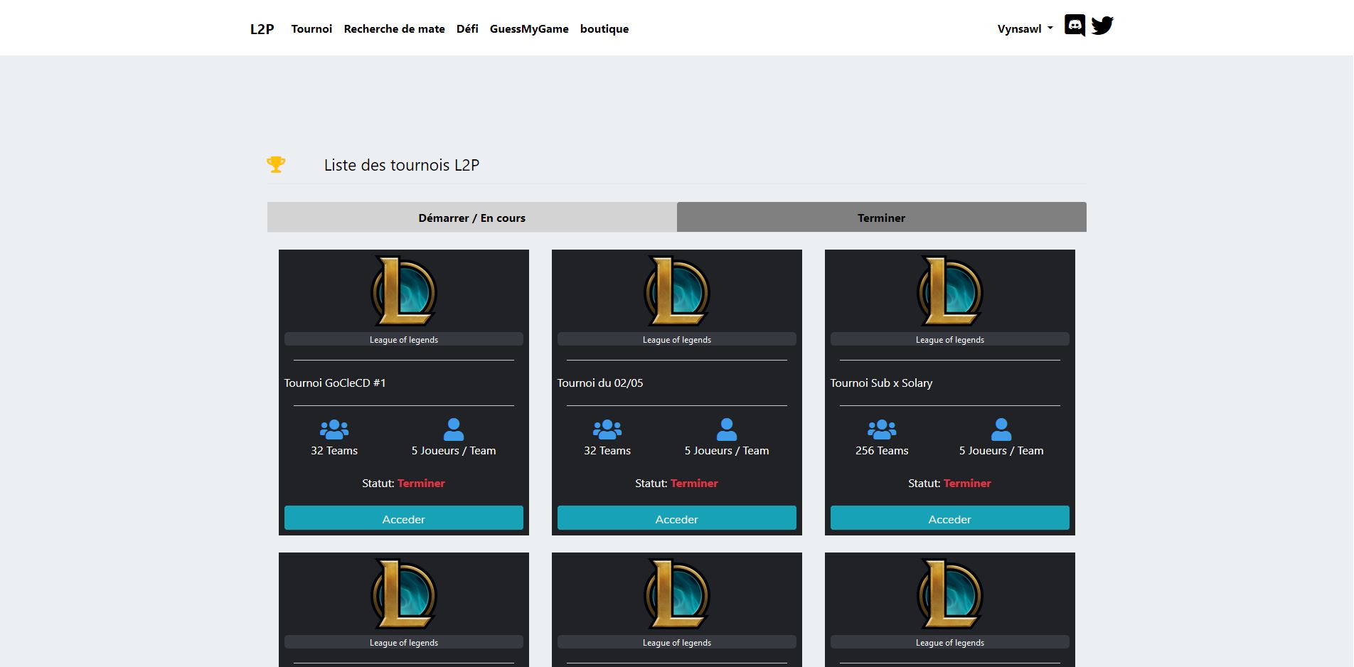
As I said, the design of L2P.lol is not very attractive. First, the UX is completely not understandable. You have a setting page to change informations about your profile and a second one named "Profile" to set your in game informations that players can see. To activate the Dark Mode you have to go into the setting page. These are two UX issues but there are a lot more. And then the UI, there is no brand identity, just a "light mode interface" and a "dark mode interface" (if I can name it like this).
Process
Inspirations
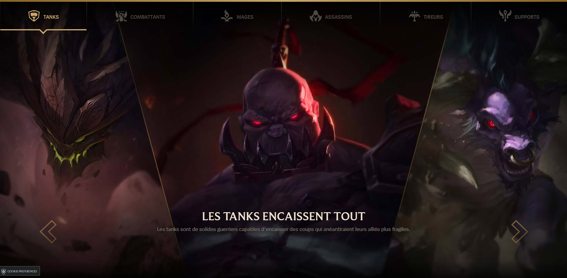
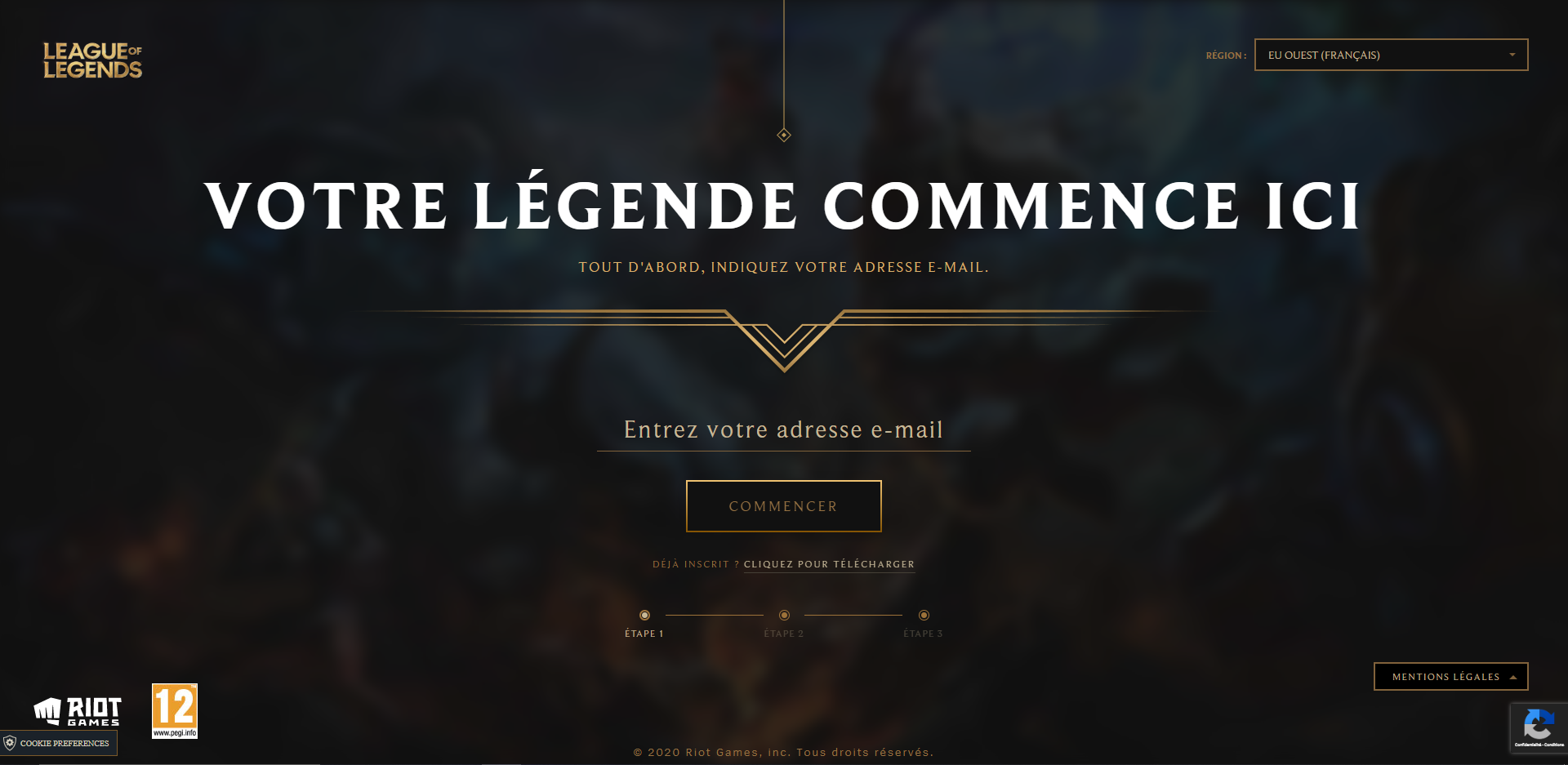
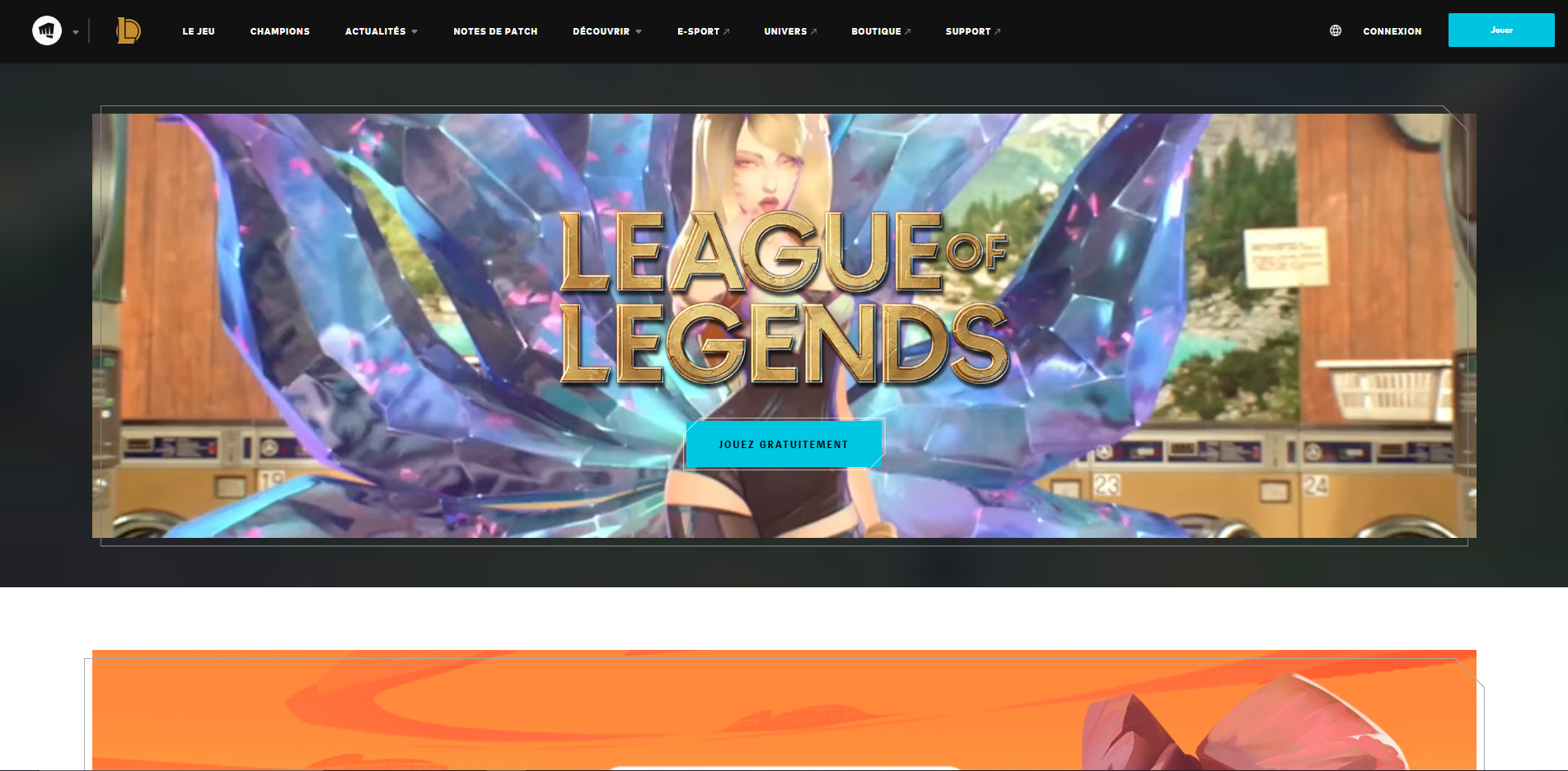
After some researches, I took inspirations from the two main topics of L2P.lol, League of Legends and Twitch. I visited the League of Legends website to
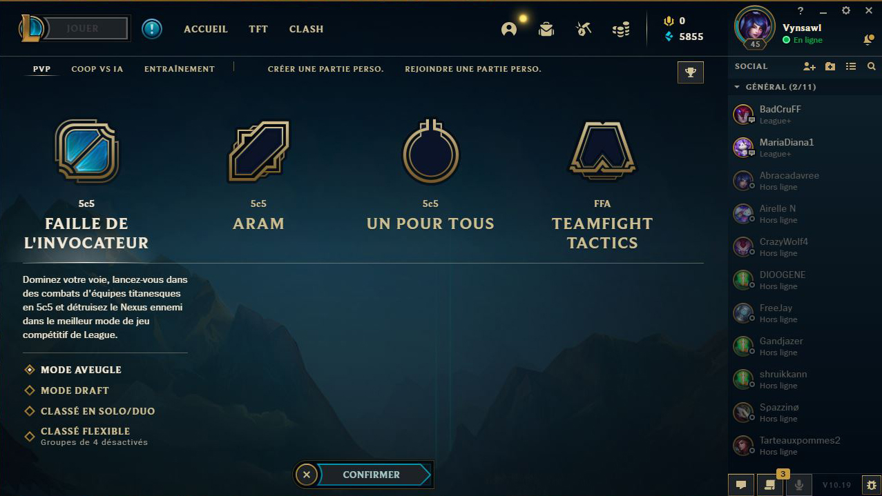
see how they present their game and modify the art direction for the UI (buttons, articles, menu, ...). I also took inspiration from the League of Legends
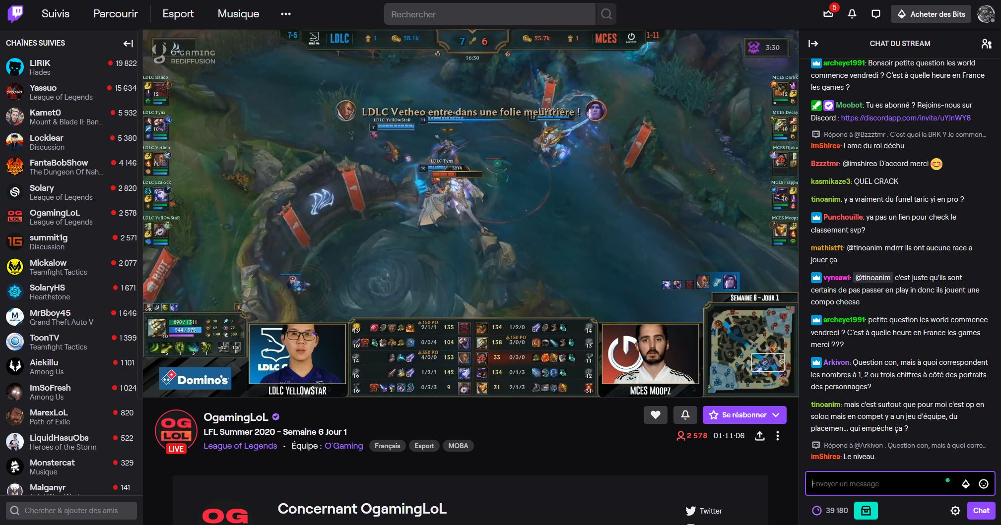
game client more for the colors and icons. Then from Twitch, my sight was focus on the font, their Dark and Light interfaces and how they use colors.

Hierarchy
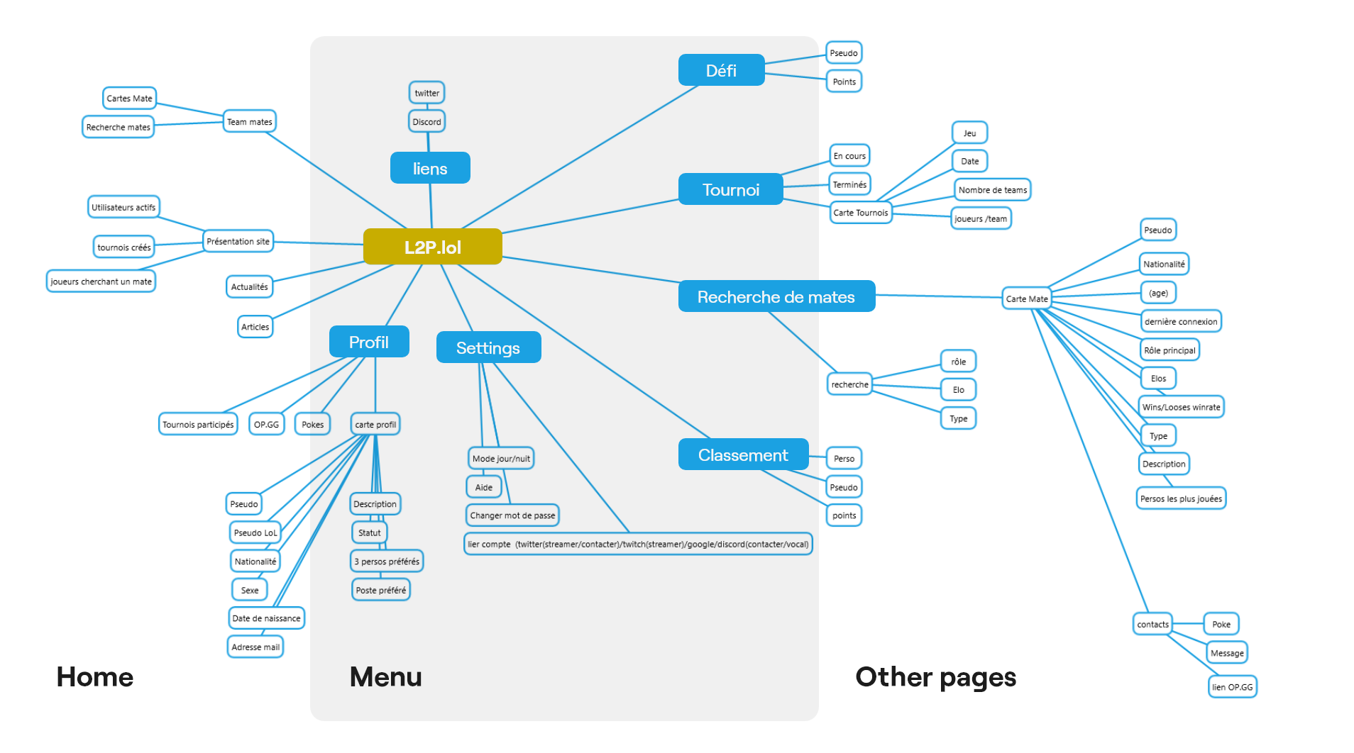
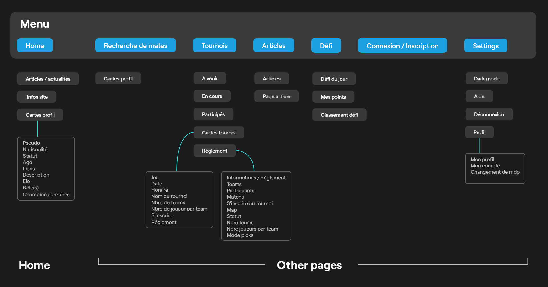
I made a mind map to understand the hierarchy of L2P.lol and its elements and pages. Thanks to this I known how to modify the UX of the website to make it more understandable and clearer. I created my own hierachy of pages and elements, and minimized the number of graphic elements like gamer profil cards that had 3 differents way to be shown.
Interface
Identity
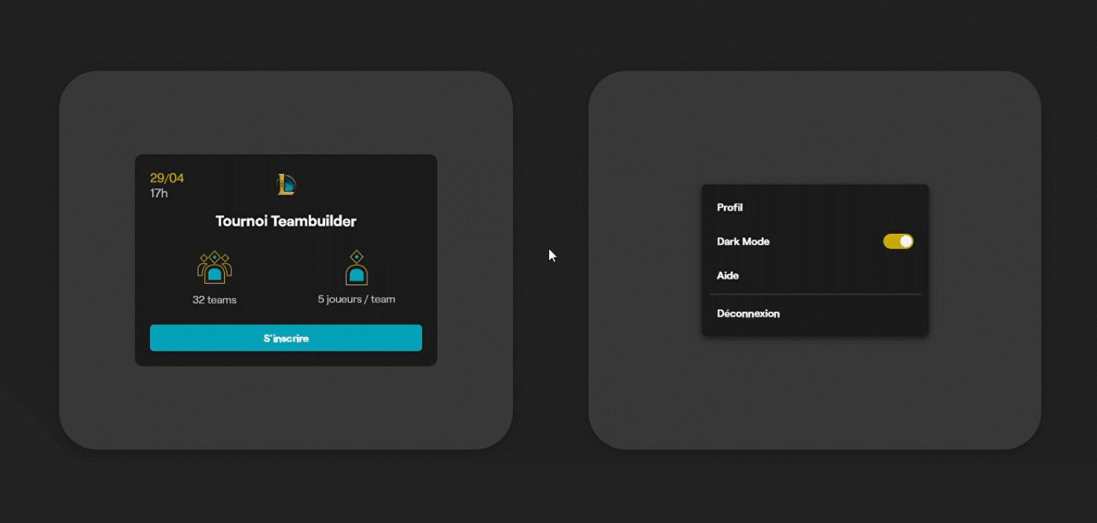
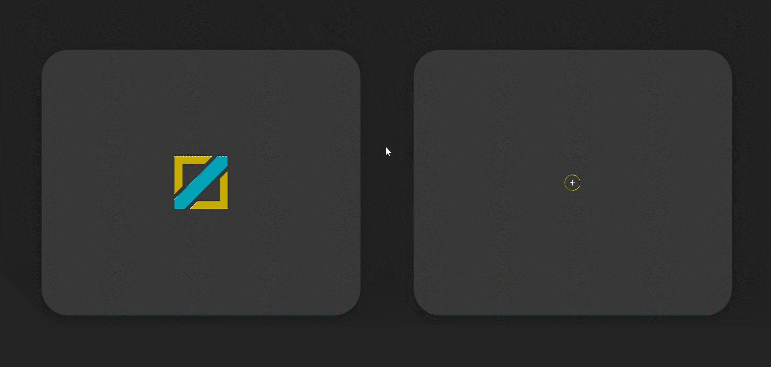
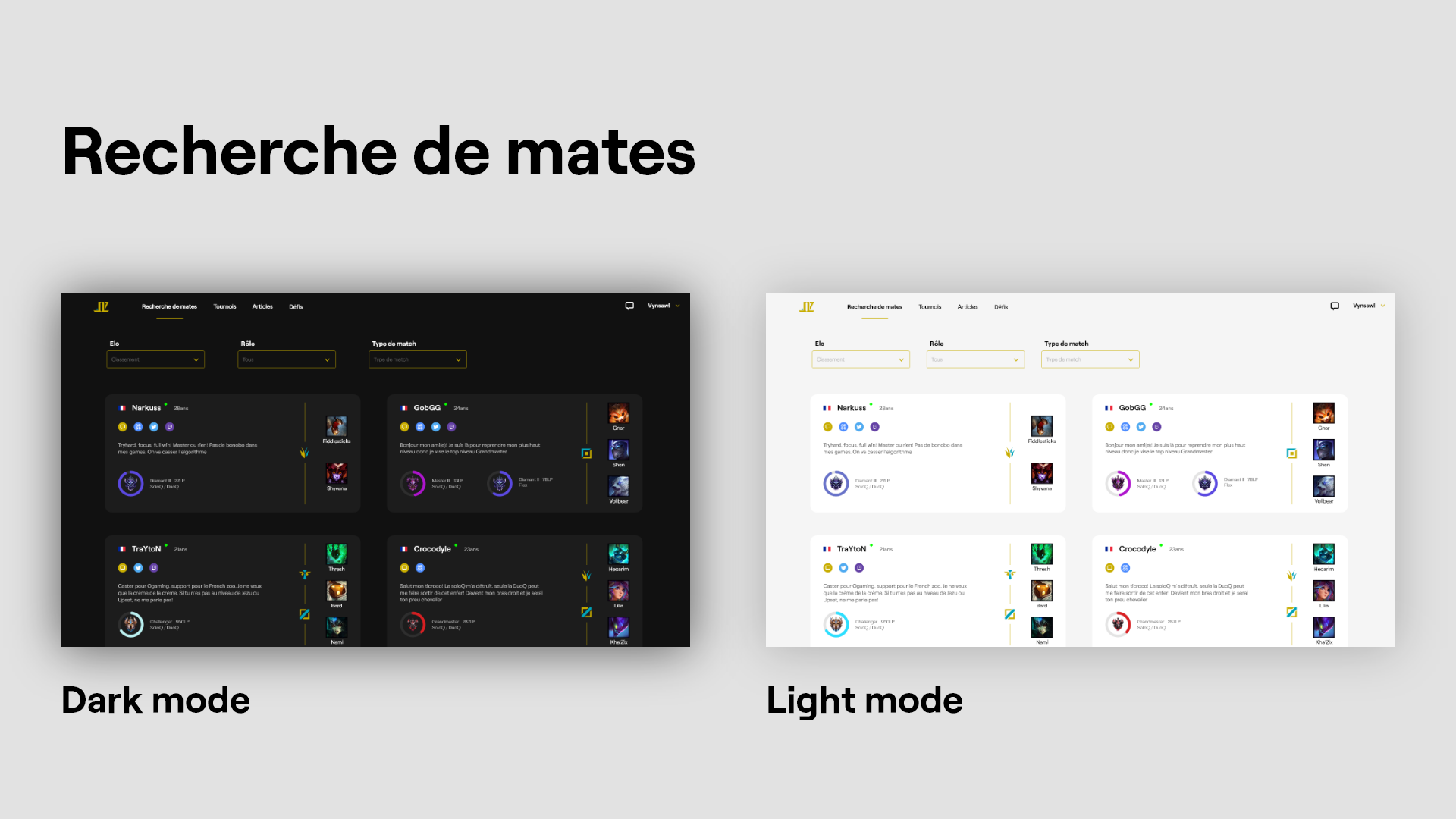
I defined the brand identity using the yellow and blue of League of Legends I slightly modified to fit a nice contrast. Icons are made with sharp angles and thin borders in an original style.
Dark mode
I set a Dark mode for the website because a lot of gamers play during night and a bright interface hurt eyes. It also suit the taste of users that are moreinterested into a dark interface.

Prototype
Animations
In order to understand and test the limits of Adobe XD I created a hight fidelity prototype. I made hover, click and page transitions animations.